Written by Martin Esteves
What pictures would you pick of yourself for a “now and then” slideshow? Would the choices accurately depict progression or would they represent a cultivated presentation of how you’d like to be thought of?
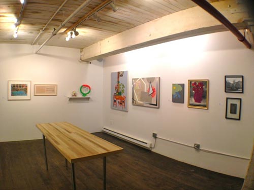
Calico Brooklyn’s “Throwback Thursday” is an art show that compares old and new works from a kind of high school yearbook haircut stance (the title comes from the urban dictionary definition to this effect). Pairings by ten artists are hung with a newer piece on the right and an older piece to the left.
There is a historical fascination with linear evolution and eureka moments in art. Mondrian’s dissolving trees now seem as if made for step by step textbooks and there are actual textbooks devoted to the likes of Picasso’s first African mask and Pollock’s first drip. This show makes no effort towards either of these romances. And how could it with only two pieces chosen for each contributor? There are no attempts to reveal breakthrough points or charted advances here. The pieces essentially become diptyches, new works collaged in a kind of Buzzfeed cutup parade.
The longest time between any two works is only about twelve years, and this, with the two by two format, creates rules for a kind of parlor game. The fun comes from the variety of results within these rules. The gamut runs from strict commitment to wild experimentation. Assumptions about traditional formality and punk why-notness are ping ponged back and forth, mashing up the very idea that artists are working away from something and towards something else. The left piece=old / right piece=new setups don’t just represent before/after shots. The feel here is more of a hinge that could swing either way.
Rachel Farmer’s prairie moms (unless that’s Marlon Brando under there) still swing their hatchets years after the gridded dresses foretell their coming physicality. Charles Wilkin also hones a theme with a more resolute version of his ghostly collaged ladies. Mark Mann offers a more distinct change, swapping a 60’sish color saturated swimming pool appropriation for sepia toned silent era text – moving both backward and forward in time with what “art” is supposed to look. Stacie Johnson’s lush painting of ungrounded furniture, plants, and lamp only hint at the floating abstraction to come.
It is interesting to note the examples of what “progression” might mean here, specifically when it comes to straightforward depictions vs wilder abstractions and manipulation. Lauren Silberman moves from a tampered and multi exposed image of a ferris wheel to a clear shot of a wrecked speakeasy and the latter result is even more disturbing despite the notion that images mangled by the artist can be more surprising.
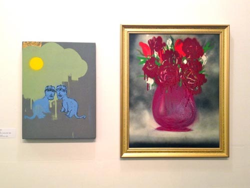
Thomas Buildmore made his blue surreal beasties before his flower pot but the still life seems even odder because of it’s off kilter take on something not so freely whimsical. Traditional core painting classes have always had students suffering through still lives, itching for the freedom to return to the monsters they used to draw behind the algebra teacher’s back. Much of the work in “Throwback Thursday” plays hopscotch on values of tradition and radicalism. These values lose their context when artists becomes unstuck in their own post modernism and a show like this doesn’t take itself too seriously.
This is a curated show after all, so the results come from the choices. Choices that don’t bear the weight of heavy concept and like a “then and now” vanity slideshow create a mosaic of however we want to be seen and thought of.

